Picked up the Business section of Monday’s San Francisco Chronicle and saw a very interesting chart on the top left. Bloomberg had ranked U.S. financial centers with Bloomberg bureaus based on the price of sushi, as a proxy for the cost of living.
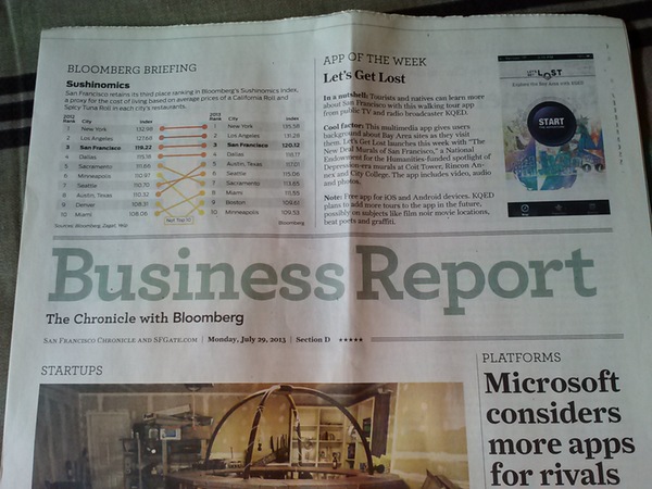
Monday’s Chronicle
Cool! Definitely something worth sharing with links back to either the Chronicle or Bloomberg.
That’s when they made me work.
I couldn’t find the chart they ran.
Online, and behind their paywall, the Chronicle showed this one:

Chart from Paywall
Kind of blah in my opinion. I really liked the one from the paper, so they forced me to take a picture of it to post.
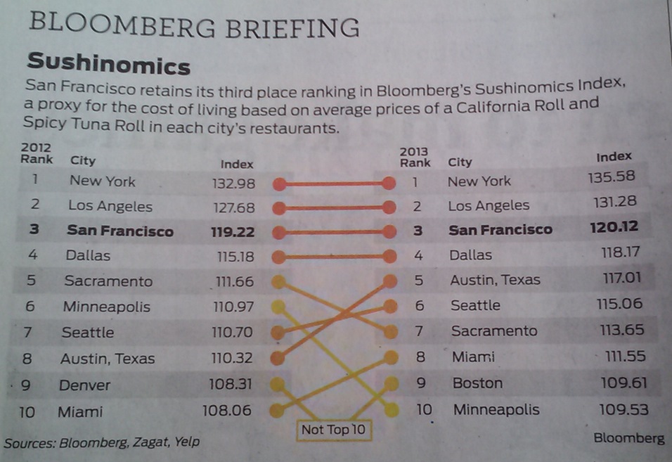
My handi-work.
You can find the data on Bloomberg’s site.
And if you are really curious, here’s a link to where Bloomberg has all kinds of interesting stats sorted by date. Please note that the interface is kind of fancy. You need to start by mousing over the different bars and then clicking for details.
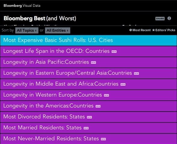
Bloomberg’s Best & Worse
Here’s one I just found about beer consumption.
In closing, here are my two cents:
- Putting a spin on the numbers is a great thing in terms of making things relevant.
- Note to Bloomberg and the Chronicle… Please make it easier for us to share this awesomeness.
##


Speak Your Mind