We introduced the “SNapkin” concept in this post. Here’s another to peruse and ponder. Enjoy!—The Gang
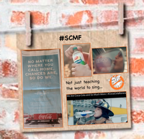
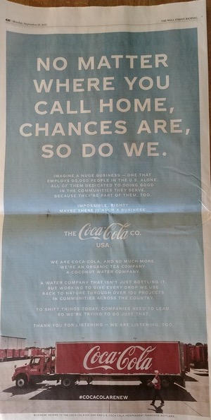
First of all, how do you not like an ad that has such awesome colors. That blue is a Jedemi fav!
And here it is, so you can get a closer look:
Okay, so we are not a big fan of the ALL CAPS font.
AWSI, this is The Coca-Cola Company out to make an impression… and encourage you to be more curious.
NO MATTER WHERE YOU CALL HOME, CHANCES ARE, SO DO WE.
Right?
The ad is copy-heavy… all the more reason to cut to the hashtag: #COCACOLARENEW
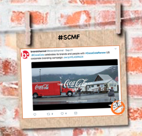
That led us to this:
Included is a 30-second spot that goes way too fast as your brain plays connect the brand games.
And there’s more!
We were reminded of this fine campaign from BASF:
And The Enchanted Jukebox Sez…
Thanks for reading & listening!
—Dossie & The Gang
P.S. We’d love to hear about your #SCMF findings. Don’t be shy!
Does this (below) feel better visually to you?
At least the mind can make out the words. To us, the other way is like reading a vanity plate.
–The Gang
Update: 20 September 2017
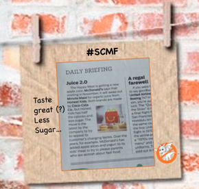
Apparently they are so diversified that they can swap one of their brands for another that has half the calories and less sugar.



Speak Your Mind