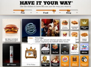
The Wall Street Journal posted a story about Burger King’s redesigned website (www.BK.com) that caught my attention. They took all things Burger King (i.e.well-known but long-gone ads such as “Subservient Chicken,” “Whopper Freakout,” and the “Simpsonize Me” campaign) and put them all in one place. It’s like a homecoming for the microsites and a celebration of a lot of break-through creative.

Curious, I wandered over to see for myself. All I can say is that the WSJ write-up didn’t do it justice. Playing off Burger King’s famous “Have it your way” slogan, the site actually lets you adjust what you see by moving sliders in three categories: Fun, Food, King.
So, for example, if you find the King super creepy, you can take the slider all the way to the left, leaving Fun and Food items to win over the screen.
If you love Fun (and who doesn’t?), you can drag that slider all the way to the right.
It’s brilliant! It is also WAY sticky (a marketing person’s dream).
Kudos to BK for this fine effort.
###


Speak Your Mind