
On Monday there was an AT&T “takeover” of The Wall Street Journal as a true “page-turner” campaign occupied A7 through A14 of the front section.
The first page had some eye-catching copy where the words are staggered (2 to a line, 3 to a line, etc.) and a very clever rendition of the “&” (ampersand). The only hint that this is from AT&T at this point is the globe logo in the lower right corner.
Upon turning the page (A9), we see another clever rendition of the & made up of a whole bunch of them.
Note: So far the eyes are only focused on the right side pages.
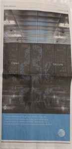
Next page turn (A11) brings another version of the & which makes you work a little It appears between the words “Open” and “Secure.”
The A13, right side page had yet another clever & between “Here” and “Everywhere.”
That’s 4 pages of intrigue that engages.
And then, in our mind’s ear we imagined a tape rewinding.
Do again!
After all, this was a major buy in a popular, well-read business publication. Let’s look at it more closely.
Take 2:
This time we spread the paper out on a big table so we could get the full effect — by looking at the left and right side ads at the same time.
Aha! It WAS a continuous picture reading from left to right. The globe logo only appears on the lower right of the right-hand side page.
Interesting.
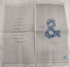
So page A8 was eight lines of words with & connectors. The payoff was on A9:
Discover the power of &
Aha! Makes even more sense. We were missing half the story before.
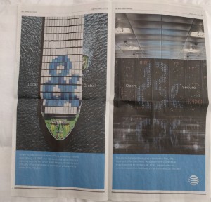
The full facing pages A10 & A11 were more of a visual play. Local & Global on the left and, as mentioned before, Open & Secure on the right.
Wait… let’s rewind again.
Yes, those are from the first two lines of A8.
Page turn to A12 & A13 where we see:
Speed & Precision on the left page, Here & Everywhere on the right.
Rewind back to A8. Yup, those are Lines 4 and 8.
Now to the last page, A14, which is on the left side of the newspaper.
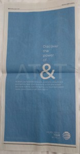
Indeed, the payoff for hanging with the story, we get a very subtle AT&T. and more copy.
Plus the globe logo on the lower right has a tag: MOBILIZING YOUR WORLD.
Humm… that last part isn’t as connected (feels a bit like a retread)
Shall we rewind one more time (with feeling)?
No & That’s a Wrap (for now)!
Something’s up for sure. Based on the seemingly “regular” copy that also appears (see A9, A10, A11, A12, A13 & A14), it looks like a Business-to-Business play. With the dollar investment made for this particular ad, we suspect that more, multi-platform renditions of the messages in this Journal pieces, will be distributed & talked about.
One last note. We are guessing that AT&T would have loved making the call-to-action URL something like:
att.com/& or
att.com/PowerOf&
Instead, the URL is: att.com/agility.
Maybe is it a case of HTML code not cooperating.
& is the code for ampersand.
Stepping back, “agility” is not a bad message, just a tired (as in overused… long in the tooth) one.
What do you think? Clever ad or not?
Does it make you look at “&” differently? A good ponderable, right?
Thanks for reading and #SCMF!
-The Gang
Note: We’ll be watching for posts about this ad campaign & to see what creative AT&T has up its sleeves.



















Speak Your Mind